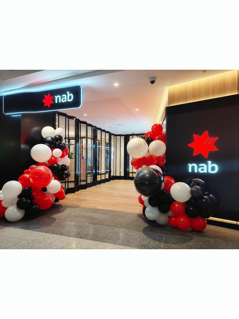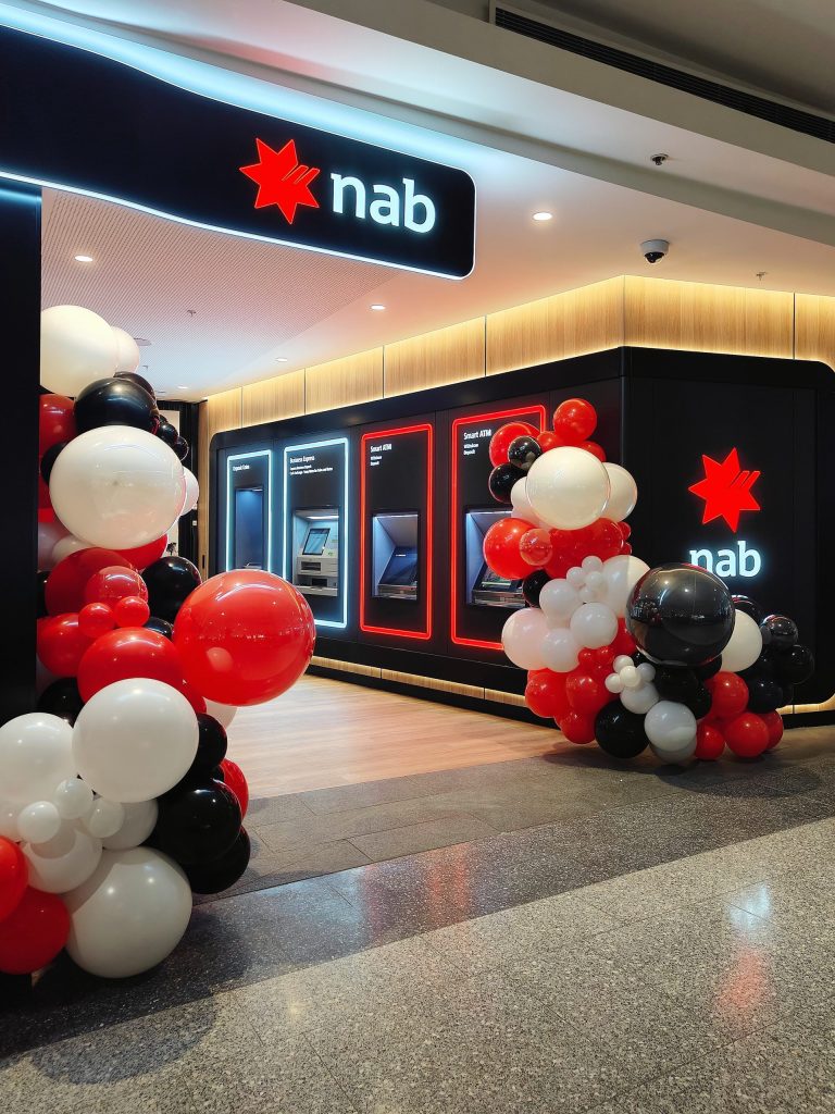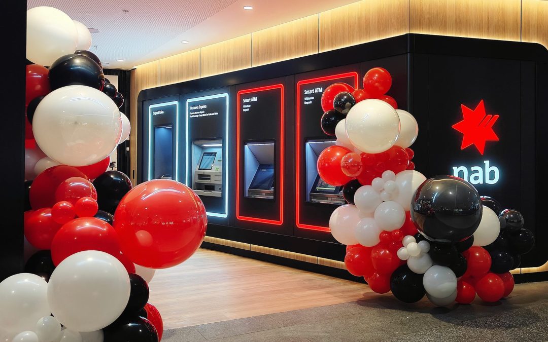
For this bank opening, the focus was to create a setup that reflects professionalism while still adding a sense of celebration. The design approach was minimal yet impactful, ensuring the space feels welcoming without compromising the brand’s identity.
We worked with a classic red, black, and white palette to match the brand’s visual language. Balloon clusters were placed at key entry points, guiding attention towards the entrance while framing the space in a clean and structured way.
Instead of using large or overly complex installations, the design emphasizes balance, proportion, and placement. This allows the setup to enhance the environment while keeping the overall look refined and intentional.
This type of styling is ideal for corporate clients who prefer a more understated yet effective visual presentation — one that communicates professionalism, clarity, and strong brand alignment.